
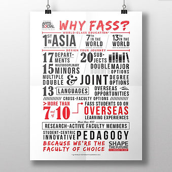
As with any educational institute, the key challenge is engagement. NUS FASS had previously used a bullet point format for key faculty advantages. Thus, the need for a revamp of how the information is presented.
The challenge for such projects always comes in the form of layout and typeface choices that suit the space and that also ensure legibility.
Recruitment Typography Poster
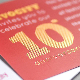


VivoCity's 10th Anniversary featured a slew of activities which included a carnival.
Inspired by that theme, we conceptualised a die-cut 'pull-out' invite which replicates a spinning carousel when the recipient pulls out the invite.
The 'pull-out' features 10 horses, which also ties in with the 10th Anniversary theme.
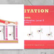
10th Anniversary Invite


The wacky face is a combination of 2 photos.
There is always a love-hate relationship going on with stock images – designers cannot live without them, but can never find what they want.
So, we often have to create what does not exist.

New Croissant Flavour Campaign
Beast & Butterflies is the resident restaurant and bar for M Social Singapore. A young and creative hotel designed by architect and product designer extraordinaire, Philippe Starck, its philosophy is always in pursuit of contemporary ideas.
The style of illustration mimics the originality and artistry of sketching. which reflects M Social's approach to creativity and ideas.
Beast & Butterflies Promotional Collaterals


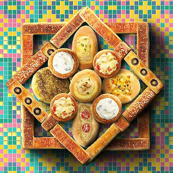
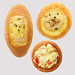
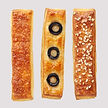
The challenge for projects that include multiple products in one single artwork is trying to make them look as one, meaningfully. This helps to draw attention to the artwork as it forms a recognisable visual that viewers can relate to.
We applied the styling of mosque-inspired tile patterns as the background and digitally edited the buns and croissants to form the Islamic eight-point star.

Ramadan Product Launch (Middle East)

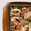

Seoul Garden HotPot was keen to explore a new direction for their Takeaway Campaign. As all their previous designs centred around actual food images, they wanted to do something different from the usual.
To achieve a fun and creative look, we used a unique illustrative style that combines realism with illustration.
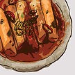
Food Takeaway Campaign

A throwback to yesteryears when life was simple; and fluffy, wobbly cakes were a warm and cherished comfort.
The choice of colours, typefaces and design elements were art directed to represent a forgotten time and evoke nostalgia, where simple pleasures like these were enough to make one smile.
Pong Pong Cake Campaign

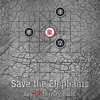

This concept applies the idea of 'checkmate' through the medium of Chinese Chess, which includes pieces like 'soldiers', 'carriages', 'horses' and 'elephants'.
In this scenario, the 'Elephant' piece has been cornered by the soldiers and carriages.
The textured background replicates the skin of an elephant to bring together the whole visual in a holistic manner.

Say NO to
Ivory Trade